Adventure Works Bike Shop Dashboard
- Jan 19, 2025
- 2 min read
Updated: Jan 23, 2025
In this dashboard, I used Power BI to build visualizations to include information about key KPI metric to aid in making more informed business decisions.
Link to Dashboard: https://github.com/schuyler-b/portfolio/blob/main/Adventure_Works_Bike_Shop_Project.pbix
I want to share some details on how I built the Exec Dashboard visualizations.
Within the Report View, let's start by adding the company logo.

Next, let's add some rounded rectangles which will become the KPI cards.

Let's copy and paste 3 more and do some formatting.

These KPI cards need to be aligned and horizontally distributed.
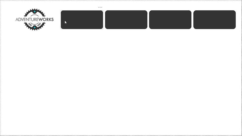
That looks much better.
I also want to make my navigation bar that will come in handy later on.

Next, let's create the KPI cards that will display our information.
I want to insert a card visual.


For this first card, I want to display total revenue, renamed to revenue.

After some formatting, this looks much more professional.

Now, let's copy and paste this KPI visual card 3 times and populate them with total profit, total orders, and return rate.

Now, let's insert a weekly revenue trending chart.

In order to build out our visual, let's put start of week on x-axis and total revenue on y-axis and then do some formatting.

Next, let's add a KPI visual card.

Within this KPI card, let's display total revenue as the value, start of month as the trend axis, and previous month revenue as the target. This creates a card displaying monthly revenue.

Let's also make KPI cards for monthly orders and monthly returns.

Now I want to show how total orders break down by product categories. I believe a bar chart will be best to show this information.

Let's add a matrix visual to show product level detail. This is a great method of organizing a lot of information for a more functional experience for the end-user. Within the matrix visual, I want to add category name, product name, total orders (displayed as orders), total revenue(displayed as revenue), and return rate (displayed as return %).

I think the matrix visual would look better and perform more intuitively with conditional formatting.

Finally, let's add some text cards with top-N filtering to display information about the most ordered subcategory and the most returned subcategory.

Thank you for following along. Have a great day!


Comments